Showing posts with label uni. Show all posts

Monday, 10 June 2013

Degree Show!

Standing infront of my work, very happy!
My boards at the University of  Lincoln Illustration Degree Show
Final Major Project, The Snow Queen

Competitions and Professionalism
My brother Alastair and I
My Mum and I
Friday the 31st of May was the opening night of my degree show. The University of Lincoln illustration degree show is running until the 14th June 10am-4pm (excluding Sundays) so come and have a look! Overall, I am happy with my work on display and very excited about perusing a career in illustration. 

Gerda's journey to find Kay, The Snow Queen

A pictorial map of Gerda's Journey to find Kay in The Snow Queen. Anderson's The Snow Queen is split into seven separate stories and consequently I chose an image to represent each story and thus Gerda's long journey to Kay. The colours used represent the Northern lights which were the backdrop to Gerda's journey. The circular form of the illustration eludes to both the cycle of the story and life. Gerda and Kay leave home as children and return finally as adults. This pictorial map was my last illustration for my Final Major Project. The target audience was sophisticated adults and it could be used within a collectable edition of The Snow Queen. Mixed media pencil, fineliner, white pen and Adobe Photoshop.

'For they were alive...all were living snow-flakes.'

Polar bear, snow flake Guard of the Snow Queen

Great porcupine, Snowflake Guard of the Snow Queen

Twisted Serpent, Snowflake Guard of the Snow Queen

'For they were alive, and were the guards of the Snow Queen, and had the strangest shapes. Some were like great porcupines, others like twisted serpents with their heads stretching out, and some few were like little fat bears with their hair bristled; but all were dazzlingly white, and all were living snow-flakes.' The Snow Queen 1845 By Hans Christian Anderson

A series of three drawings based upon the above passage of text taken from Hans Christian Anderson's The Snow Queen. I created this Guard of the Snow Queen series of illustrations using the mixed media of pencil and fineliner pen, marbled paper and Adobe Photoshop. After experimenting with paper marbling, I edited my favourite marbled pattern on Photoshop to create a symmetrical, Kaleidoscopic pattern to resemble the Northern lights above the Snow Queen's palace. These illustrations form part of my Final Major Project which was based on The Snow Queen. The target audience was sophisticated adults and the illustrations could possibly be used within a collectable edition of the book. 

Tuesday, 16 April 2013

The Big Sleep book jacket

Book Jacket
This is my final book jacket for The Big Sleep by Raymond Chandler, created using black fine-liner pen and photoshop. The Big Sleep is set during the Great Depression. Within the novel bribes and murders are committed over money. These factors inspired the use of the dollar as the basis for the book jacket design. The rat symbolises the corrupt American society of the 1930's and its moral degradation, as well as the sinful, seedy backstreets of Los Angeles. 

Sunday, 13 January 2013

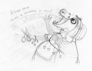
She Wanted to Eat A Child

Black fine-liner and fabric, edited on photoshop
A double-page spread illustration for a children's story about an evil women who wanted to eat a child and unfortunately ends up eating her own. I believe the layout for this double-page spread to be a success. The paper-chain children lead the viewer's eye into and along the page, effectively conveying her hunger in a sophisticated manner; the image is not gruesome or a literal illustration of the text. I am pleased with my final character design. The evil woman looks scary but not too terrifying for children, while the detail on her clothes, the hanging teeth and bonnet, adds interest to the illustration. To refine this illustration I would add a subtle flat background colour to emphasise the drawing and add a textured background to the woman's apron and bonnet to add further interest and detail.

There Once was a Woman so Evil

First character design, based upon a hippopotamus
Character design full body portrait
Bonnet detail
Character design profile
Final layout for double-page spread
Character design for an evil woman who wants to eat a child. The anthropomorphic character is based upon a hippopotamus. The pretty lace apron and dainty bonnet adds detail and thus creates an interesting character. Her feminine exquisite, charming style of dress is in direct contrast to her horrid personality; an ironic twist. The hanging, pulled teeth subtly hint at her cruel intentions. Overall, I feel the teeth and expression need to be toned done for the child target audience. Conveying a smiling hippo happily eating the paper chain will make for a more sophisticated, suitable image than an angry ravenous hippo.   

Everything Stops for Giant Pocky

Pencil, black fine-liner and photoshop.
This illustration is for an advertising brief, targeted at a teenage audience. The product being advertised is Giant Pocky. The theme of Frankenstein's Monster and a rough layout including the characters Frankenstein, his male assistant and his monster was given, from which a final illustration was to be developed. Using these characters, I transformed Frankenstein into a bear and changed the gender of the assistant. The brief included the task of designing the text, except for the word Pocky. I am happy with the hand-rendered lettering; developing an ECG wave into text has added interest to the illustration. I employed limited colour within the design, using only red to emphasis the brand and create a bold strong illustration. To refine this advertisement, I would add more tonal shading and line work to the characters, as seen within my Social Gathering illustration, to add interest, detail and depth.

The Social Gathering

Mixed media pencil, black fine-liner and watercolour paint. Final edit on photoshop. 
The illustration above depicts the seven characters I created over the summer: psychedelic butterfly, Ollie the Orangutan, Foo Dog, Tortoise-shell hare, Thumbelina, Horn-boy and Oceana, taking part in a social activity. The activity illustrated is sailing, and the drawing includes a self-portrait. Constructing an effective composition to include all eight characters was challenging, however I am very happy with the end result. The use of tonal shading has brought depth to the drawing, the subtle details of each character brought to life through intricate line-work. The bold blue splash adds movement and drama to the illustration, symbolising the sea spray off the rough waves. I have entered this drawing into the V&A illustration awards 2013. 

How to Write a Book in 30 Days

Mixed media pencil and black fine-liner edited on photoshop.
This is the final editorial piece for my contemporary illustration unit. The brief was given in the form of an email; similar to one that might be received from an agent. The task was to create a cover for the supplement, How to Write a Book in 30 Days, within The Literary Review magazine. 

The supplement describes a structured method for writing a book, aiming to encourage readers to become writers. Inspired by the step-by-step element of the supplement, I began to think about how one idea has the potential to evolve into a story, which can be signified through an acorn growing into a great oak tree. Putting my own spin on this idea, I transformed the trunk of the tree into a pencil. I am very happy with the hand-rendered text, something I have struggled with in the past, which adds interest and a playful element to the illustration. To improve this design I would add a subtle background colour to enhance the detail and remove the unnecessary black outline from the words in 30 days

Monday, 29 October 2012

Madness of Crowds

This week's editorial illustration was for the article Madness of Crowds: Will Self visits Las Vegas, Its gone family-friendly. The article is based around the idea that advertising of Vegas as a family resort and the consequential increase of families staying in Vegas, will in turn end its days as a partying  and gambling resort. Therefore I developed the idea of combining dice and building blocks together. I played around with different compositions however I am still unhappy with this final layout. If I was to refine this idea I would try an asymmetric, more relaxed composition.

Tuesday, 23 October 2012

Sun, Sea, Sand...And Sniffles


This editorial illustration for a Guardian article is based upon the idea that people with heavy workloads often get ill on the first day of their holidays due to their stressful day-to-day life. Consequently I looked at imagery which signifies holidays (suitcase) and illness (pills) and combined these two ideas together to create my final illustration.  

Tuesday, 16 October 2012

Why Small Victories Matter

This editorial illustration is for an article taken from the Guardian on Why Small Victories Matter. The article is based on the idea that you gain greater success and happiness working towards smaller achievable targets rather than one larger target. The comparatively small size of the central target-coloured duck illustrates this idea. The idea of hook-the-duck derived from the key words small victories which in turn led to the idea of fareground games which involve targets.

Tuesday, 9 October 2012

How to Decorate

This illustration is an editorial piece for an article taken from the Guardian called 'How to...Decorate.' The basis of the article is the idea that humans have an instinct for external decoration, with appearance being viewed as more important than character. Inspired by the reference to peacocks in the article, I based the henna pattern around peacock feathers, the henna itself conveying our innate need for personal decoration. Experimenting with colour for the background, I liked the contrast between the red henna and blue background, however in context I feel the hands look more striking against a white background. 


Thursday, 27 September 2012

Oceana


This character was inspired by Ian Macarthur's highly detailed, intricate illustrations. Influenced by his choice of mixed-media, I similarly created this illustration using pencil, pigment pen and watercolour paints. The stern expression, strong stance and vivacious splash of colour convey Oceana's powerful, wilful, spirited personality.

Antlers


This graphite-on-paper drawing was inspired by the amazing Shaun Tan's illustrations. I feel I have successfully conveyed the personality and emotion of this character through his expression and body language. Overall I am pleased with the final illustration of this timid, shy, endearing antler-boy, who is my favourite character out of the seven.

Thumberlina


I created this character on a piece of wood using black fine-liner and chalk, inspired by Audrey Kawasaki's beautiful, evocative wood-based paintings. This character is influenced by Hans Christian Anderson's fairytale Thumbelina, as seen through the lily pad and petal dress. I like how Thumbelina's simplified style contrasts with my other more detailed characters. 

Wednesday, 26 September 2012

Tortoise-shell hare

Graphite on paper
This character was influenced by Mark Ryden's graphite-on-paper creatures. Ryden's evocative, poignant artwork contains layers of meaning and subtle twists. Inspired to create a thought provoking character, I decided to play on the Aesop's fable The Hare and the Tortoise in order to produce this intriguing character.