 |
| Black fine-liner and fabric, edited on photoshop |
Sunday, 13 January 2013
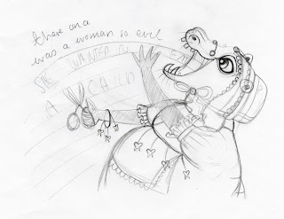
She Wanted to Eat A Child
There Once was a Woman so Evil
 |
| First character design, based upon a hippopotamus |
 |
| Character design full body portrait |
 |
| Bonnet detail |
 |
| Character design profile |
 |
| Final layout for double-page spread |
Character design for an evil woman who wants to eat a child. The anthropomorphic character is based upon a hippopotamus. The pretty lace apron and dainty bonnet adds detail and thus creates an interesting character. Her feminine exquisite, charming
style of dress is in direct contrast to her horrid personality; an ironic
twist. The hanging, pulled teeth subtly hint at her cruel intentions. Overall,
I feel the teeth and expression need to be toned done for the child target
audience. Conveying a smiling hippo happily eating the paper chain will make
for a more sophisticated, suitable image than an angry ravenous hippo.
Everything Stops for Giant Pocky
 |
| Pencil, black fine-liner and photoshop. |
The Social Gathering
 |
| Mixed media pencil, black fine-liner and watercolour paint. Final edit on photoshop. |
Labels:
Antlers,
butterfly,
drawing,
event,
Foo Dog,
horn boy,
illustration,
light house,
Ocean,
orangutan,
sailing,
sea,
social gathering,
third year,
Thumberlina,
tortoise-shell hare,
uni,
waves
How to Write a Book in 30 Days
 |
| Mixed media pencil and black fine-liner edited on photoshop. |
This is the final editorial piece for my contemporary illustration unit. The brief was given in the form of an email; similar to one that might be received from an agent. The task was to create a cover for the supplement, How to Write a Book in 30 Days, within The Literary Review magazine.
The supplement describes a structured method for writing a book, aiming to encourage readers to become writers. Inspired by the step-by-step element of the supplement, I began to think about how one idea has the potential to evolve into a story, which can be signified through an acorn growing into a great oak tree. Putting my own spin on this idea, I transformed the trunk of the tree into a pencil. I am very happy with the hand-rendered text, something I have struggled with in the past, which adds interest and a playful element to the illustration. To improve this design I would add a subtle background colour to enhance the detail and remove the unnecessary black outline from the words in 30 days.
Subscribe to:
Comments (Atom)
